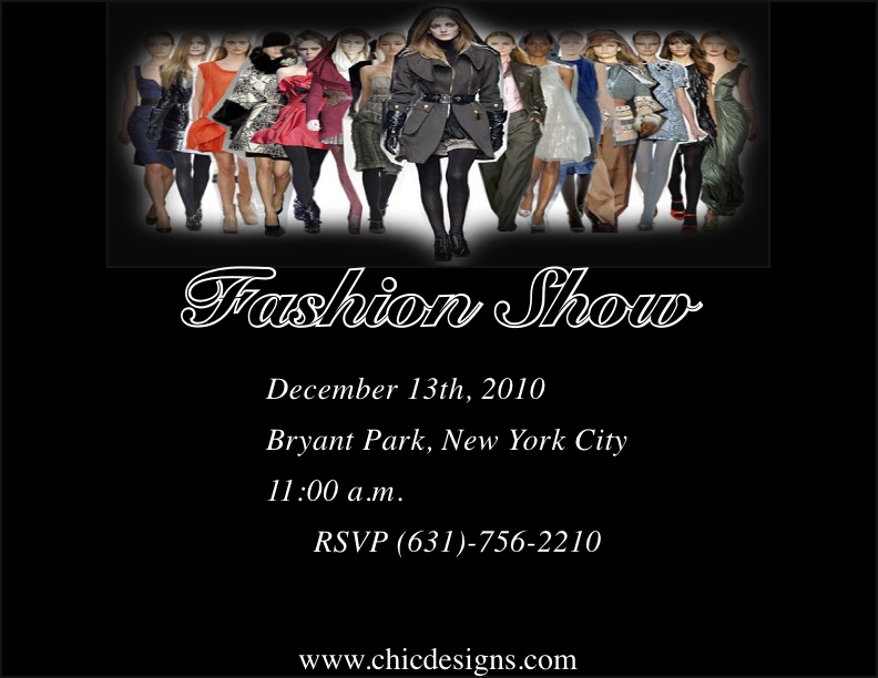
I decided to make an advertisement for a fashion show for the company that I used in my first design. Therefore, I wanted to keep the same similar idea that the company has which is a minimalisdtic, clean layout with only the bare necessities. The more information and images there are leads to an overcrowding and takes away from the main point. I decided to keep the focus on a black and white scheme with a sleek black background and all of the text in white. However, for the heading of "Fashion Show", I did the opposite and made the font black to blend in with the background but then put a white stroke around it to make it stand out. I also used an italic script font for the majority of the text with only a regular font for the website information. With the main image at the top, I decided to put it against a white background to higlight all the different colors in the outfits and then feather the outside of it with a bit of gray to add a bit of color. I then put a box around the image as a border to add another visual effect to the image.